

Last week some friends and I were discussing a New York Times Op-Ed piece entitled “My Endless New York.” One paragraph in particular started the conversation of the definition of a “world city,” its outlying areas, and how it applies to New York:
[New York] is not the great American city — that will always be Chicago. New York sits at the edge: like Istanbul or Mumbai, it has a distinctive appeal that lies precisely in its cantankerous relationship to the metropolitan territory beyond. It looks outward, and is thus attractive to people who would not feel comfortable further inland. It has never been American in the way that Paris is French: New York has always been about something else as well.
After discussing the column, we managed to shift gears and talked about the arbitrary nature of American state borders in relation to national identities and culture.
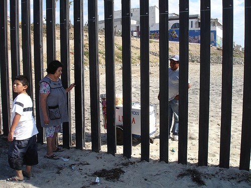
One example I brought up was the US-Mexico border and some studies I read that showed San Diego-Tijuana was the most economically, socially and culturally asymmetrical border zone in all of the United States. All it took to do so was for someone to draw a line on a map.
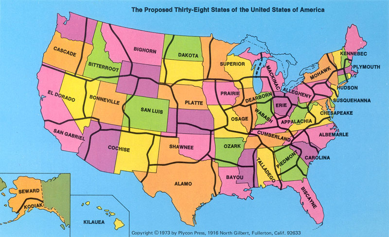
I also mentioned a map by C. Etzel Pearcy, which is posted at the top, called the “The Proposed Thirty-Eight States of the United States of America.”
In the early 1970s, Pearcy, a Cal State Los Angeles geography professor redrew and renamed America’s state boundaries based on a host of varying criteria. According to the 1975 People’s Almanac, “when Pearcy realigned the U.S., he gave high priority to population density, location of cities, lines of transportation, land relief, and size and shape of individual States. Whenever possible lines are located in less populated areas.” Also, the names of the new states were based on a student survey of each area’s most identifiable physical or cultural attribute.
Pearcy wrote that his reasoning for realigning the American map was because the early drawing of America’s boundaries was done so when the country was scarcely populated. “Thus, it was convenient to determine boundaries by using the land’s physical features, such as rivers and mountain ranges, or by using a simple system of latitude and longitude. Proof of this lies in the fact that the Mississippi River borders 10 States. The practicality of old established State lines is questionable in light of America’s ever-growing cities and the increasing mobility of its citizens.”
Looking at this peculiar map, I couldn’t but notice how spot-on some of the new states were. Rightfully so, northern and southern California were divided; the southern portion of California now includes the most populated cities in the west like Las Vegas and Phoenix. The northern California region absorbed much of Nevada. Given most of my experiences growing up in near Nevada, I can attest to the cultural and geographic similarities of the state of El Dorado.
Talking with my friend Gene, he agreed that Hudson, the state which would contained America’s Megalopolis of New York City, Philadelphia and New Jersey, would be a perfect fit. Kansas City would also no longer be forced to be two in two different states.
In some ways this map is much like congressional redistricting. While congressional districts are confined to the borders of a state, every ten years politicians use census data, demographics and area voting history to redraw and gerrymander new political zones for their best political influence. The only difference between this map’s fantasy and once-a-decade redistricting is that redistricting is a reality.
While this map is obviously nothing more than a pipe dream, I think it shows to people that people from the United States are not solely defined by their respective state’s borders. I feel that sometimes, I have more in common with someone from Reno or Carson City, than say Orange County.
Anyway, maps like this rekindle my love for the art of cartography. It doesn’t just have to be about telling someone where they are or how to get somewhere they want to go. A map can help shape opinion, challenge your point of view or even facilitate a new understanding of one’s place. Very soon, I hope to read Mark Monmonier’s book How to Lie With Maps. From what I’ve heard, it discusses how maps can change the way we discern the reality around us.
In the future, I hope to blog more about geography and cartography. What did you think of this map? Is it interesting? Informative? Stupid?

Too bad this map really is just a fantasy! I like this blog post and the subject. The way world maps are drawn– with the southern part looking disproportionately smaller than the northern part– is similarly interesting.
I’ve never read the book, but I first got interested in the subject of altering maps to fit our modern world/modern data while watching a West Wing episode where the staff keeps delaying a meeting with some organization promoting equality in cartography. The staff is kind of like oh this is a waste of our time, (“There’s prejudice in mapmaking?”) but then they end up meeting with them and are blown away when they see maps shown to scale and are convinced their childhood geography lessons are ruined.
It’s kind of a funny moment in the episode, but afterwards I ended up looking up the subject and saw how closely it was based on a real life organization (I think) that promote the Gall-Peters projection. It’s controversial but probably mentioned in that book you’re about to read (which I have not read either).
Anyway, I didn’t mean to randomly ramble on. Cool post.
I’ve never read the book, but I first got interested in the subject of altering maps to fit our modern world/modern data while watching a West Wing episode where the staff keeps delaying a meeting with some organization promoting equality in cartography. The staff is kind of like oh this is a waste of our time, (“There’s prejudice in mapmaking?”) but then they end up meeting with them and are blown away when they see maps shown to scale and are convinced their childhood geography lessons are ruined.
this map is to plain add the names of the rives ans it b prfect :))