
Mapping My 2015 Swarm Check-ins
I use Foursquare’s app, Swarm, to check-in to most places I go to throughout the day. The thing I like most about Swarm is that it’s a sort log or diary of all the places I go and things I do. Because I’m a bit of a cartophile, Swarm let’s me take control of my data and visualize it in different ways. I can keep track of places I want to go, places I’ve been and trends of my activities. Most of my friends don’t use this social networking service because they don’t like to tell people where they are, which I totally understand. But because I love to travel, and I love maps, it makes perfect sense for me.
2015 was an especially good year for travel for me. I spoke and attended five different WordCamps, visited California twice, took road trips to New Orleans and Kansas City and traveled to China, Taiwan, Germany and Denmark. With all the variability in locations, I figured it would be good to visualize my persistent feeling of wanderlust.
Late last year I found this post from Sean Daniel about how to use Google Maps to visualize Swarm/Foursquare check-ins into different maps. I really wanted to map all 4,000 of my checkins, starting with my first checkin in September 2010 in Seoul, Korea, but Google Maps only allows 2,000 points on each custom map. So, I’ll save that for another time.
With that being said, I downloaded my check-in metadata for 2015 (if you have Foursquare/Swarm, you can do that here), and then imported it to Google Maps following the guide. The downloaded KML auto-opens in Google Earth if you have it installed, which is an easy way to view the data before putting it in Google Maps.
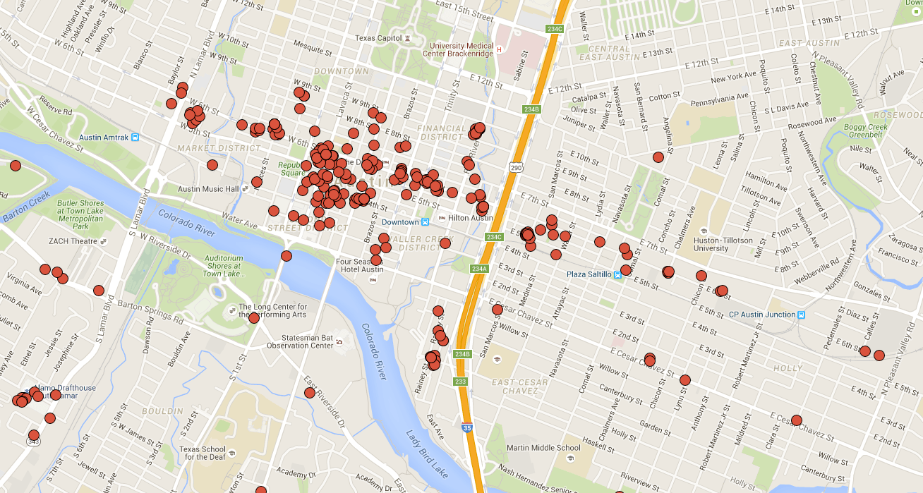
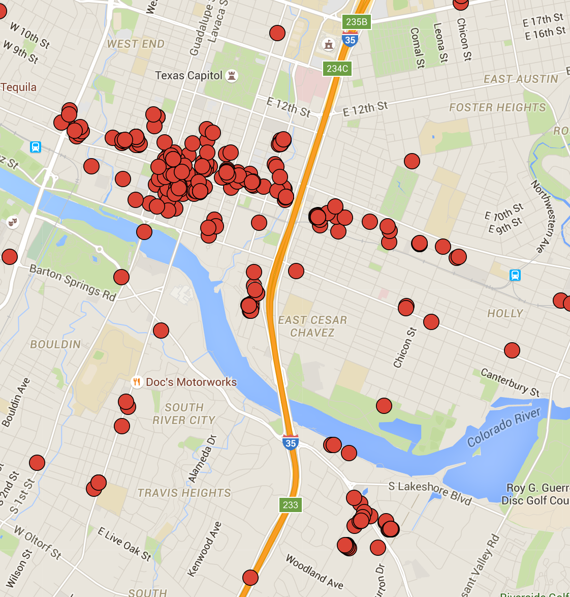
After working through Sean Daniel’s guide, (and removing check-ins from airport transfers) the pinned results show breadcrumbs of my road trips and a peppering of data from other places:
This is where Sean Daniel’s guide gets good. With the KML data I’m able to create a heat map of checkins. For many travel locales, my data is too spread out for a heat map to be of any use. So, what I did instead was create a heat map of downtown Austin, where I work and spend a lot of my free time. From there, you can get a better idea of my checkin frequency:
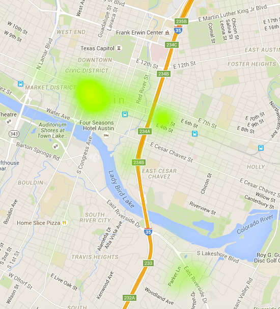
The deepest shade of green is nearest to my office and a row of bars on East 6th St., Austin. For comparison, view the same map based on individual pins.
Overall, though, this information is great for understanding my own personal trends and understanding what I do most with my time. Some observations about the checkin data that I have from the year:
- European geo-tags were the most incorrect: Most location tags for businesses/shops in Berlin and Copenhagen seem to be placed directly at the city center instead of their actual location
- I checked in 772 times in 2015, about 2.11 check-ins per day.
- I checked into a bar at least once a week from June 2 to December 20.
- I checked-in to my most-visited bar 32 times in 2015.
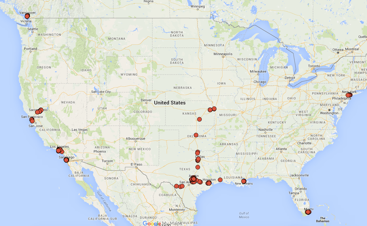
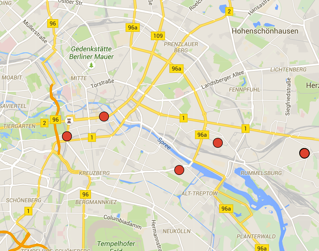
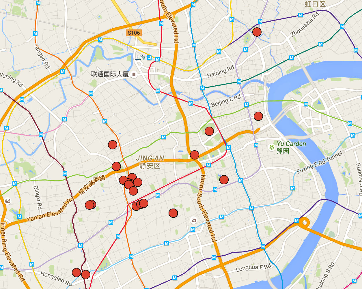
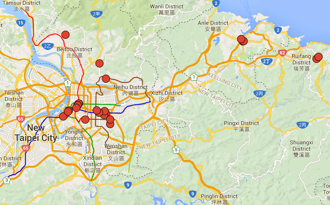
Check-ins four the four major cities I visited overseas in 2015:

About The Author
John P. Gamboa
John is a Technical Success Manager at WP Engine. Before moving to Austin, John lived in South Korea and China for the better part of four years. His life as an amateur Chinese web censorship expert, traveler, map nerd and beer geek can be found on this site.

Wish there was an IFTTT formula for this.
unfortunately it seems that foursquare removed RSS from the service 🙁